Orange
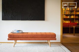
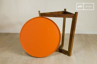
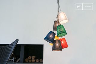
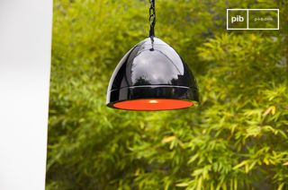
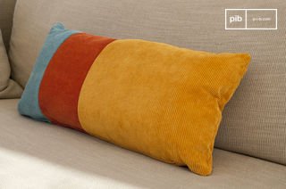
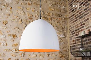
The Orange category includes furniture pieces where color acts as a visual cue. Applied to a small volume or functional detail, orange creates an immediate focal point in a sober composition. Depending on its intensity, it can signal a passageway, reinforce a contrast or liven up a neutral background. The support material - textile, metal, painted wood - determines how the hue reacts to light. Each piece of furniture selected combines this color with a specific function in the overall layout of the space.
read more >Filters
Orange furniture: signal function and visual hierarchy
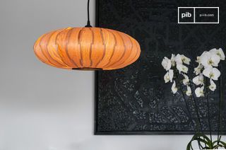
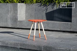
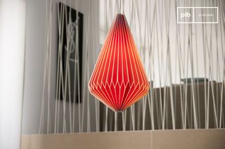
Used occasionally, orange acts as a signal color. It attracts the eye without requiring a large surface area. An orange seat, storage element or decorative module can mark an area or establish a visual transition in a room. This color is often used to create a focal point in a neutral or dark-toned décor. It structures the composition through contrast, without disturbing the overall balance if well distributed. Lorange is particularly legible in open rooms or areas with multiple functions.
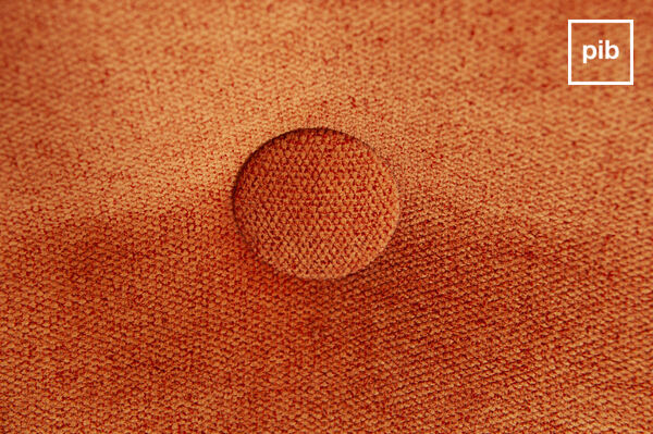
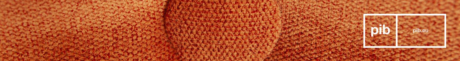
Render of color according to materials
The rendering of lorange varies greatly according to the support used. On painted metal, the hue is uniform and saturated, with a slight sheen if the finish is satin. On wood, it can be more nuanced depending on the visibility of its grain. Textiles, especially velvet and wool, absorb part of the light, making the tone denser or more diffuse. The choice of material therefore directly influences the visual impact of the furniture. Lorange on a smooth surface will have an immediate effect; on a textured surface, it will take on a more secondary role, integrated into the material.
Integrating the color orange into the layout
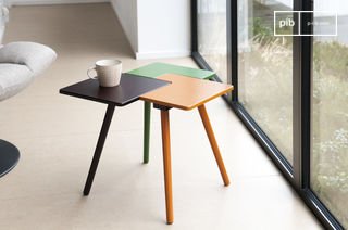
Introducing orange furniture involves defining a logic of balance with the other elements present. It blends easily with light woods, concrete gray, matte beiges or black surfaces, creating a structured contrast. On the other hand, the accumulation of colored surfaces in the same visual field can lead to overloading. It is therefore advisable to use this color only on secondary volumes or well-defined details. In some cases, several pieces of furniture can share the same orange hue if their distribution follows an identifiable line or symmetry in space.
The *Orange* category presents furniture where color is not a decorative addition, but a structuring element of space. Each piece articulates material, use and hue to reinforce the legibility of the layout without visual excess.
The *Orange* category presents furniture where color is not a decorative addition, but a structuring element of the space