Pink
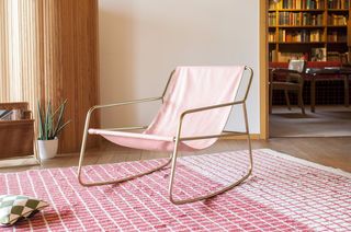
The Rose category includes furniture incorporating this hue in matte or lacquered finishes and on fabrics. Used in detail or on limited volumes, pink acts as a transitional color between neutral tones and more pronounced materials. It can emphasize a shape, visually lighten a block or introduce a discreet marker. The selection includes pieces where the shade is applied with precision, in direct relation to the material, light and intended use in the overall layout of the room.
read more >Filters

Pink furniture: linking function and chromatic balance
Pink, when used in furniture, does not seek to dominate the composition. Rather, it acts as a gentle transition between more contrasting elements. On a white wall, a matte pink chair introduces a nuance without creating a break. Between two raw materials, such as concrete and wood, it provides visual continuity. Pink lends itself to these uses because its saturation and temperature can vary without creating conflict with the other colors present. It helps to clarify the reading of a space without an accumulative effect.
Hue, material and visual rendering in furniture from the Rose category
The final rendering of pink furniture depends on the support used. On painted wood, the color retains a certain depth, with clean edges and a uniform effect. On textile, it is absorbed by the weft, producing a more diffuse result, often slightly modified by ambient light. Lacquered metal offers a smooth, continuous finish, with a gloss that varies according to the treatment. These material differences influence the way pink interacts with other elements in the room: direct light, adjacent texture, presence of reflections.
Aggregation and distribution of pink elements in a space
Pink furniture works best if integrated into a structured whole, with a clear hierarchy between volumes and materials. It can be used to distinguish a secondary area (bedside, side seat, shelf) without disrupting the main composition. The use of this color on repeated elements (legs, handles, modules) should be spaced out and coordinated with the available light. Pink works well with light greys, beiges, light woods or mineral surfaces. It is less suited to saturated or very dark environments, unless the aim is a sharp, deliberate contrast.
The *Rose* category offers furniture where color is integrated as a tool for visual and spatial adjustment. Each piece combines this hue with a specific material and use, without excess or autonomous decorative effect.
The *Rose* category offers furniture where color is integrated as a visual and spatial adjustment tool