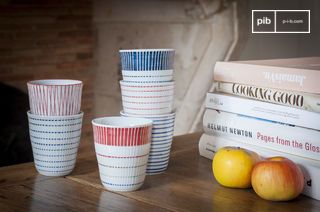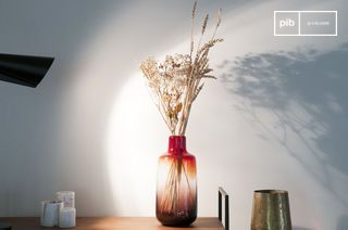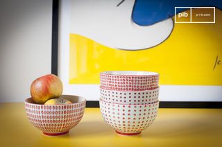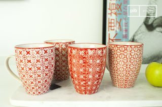
Red
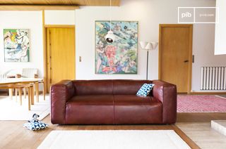
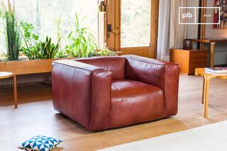
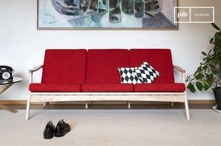
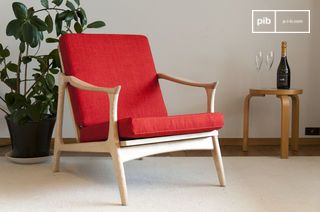
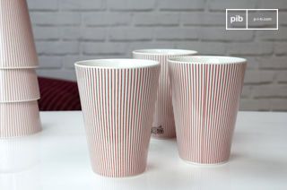
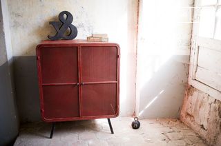
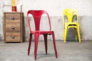
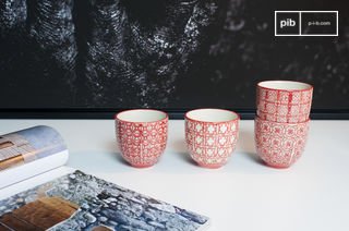
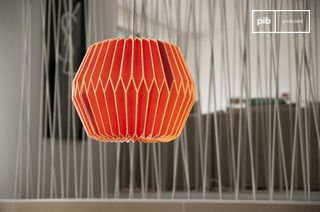
The Red category includes furniture designed to introduce a strong chromatic presence, controlled by scale, material and placement. Used in dashes on a seat, front or base, red creates a clear hierarchy in space. Its perception varies according to the finish: matte, glossy, textile or lacquered. It gives structure to a layout by establishing a precise focal point, without visual excess. Each piece in this selection rigorously articulates color and function, in direct relation to the surrounding volumes.
read more >Filters

Red furniture: controlled use of a dominant color
In interior design, red doesn't go unnoticed. It creates immediate visual tension, which calls for sparing, targeted use. A red piece of furniture attracts attention as soon as you enter the room, even if it's small. It can therefore be used to orientate the reading of a volume, to signal a function or to break up an overly neutral continuity. In a light or monochrome environment, it acts as a stable marker. The intensity of the hue, its finish and the material to which it is applied determine the effect obtained: controlled saturation or assertive focal point.
Impact of red according to support and light
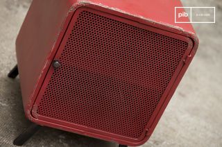
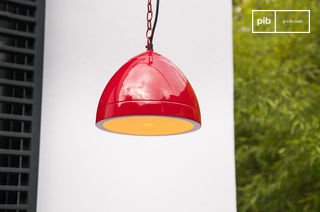
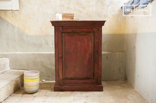
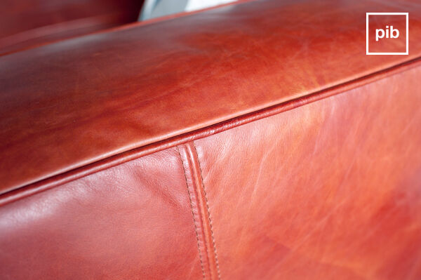
The material considerably modifies the perception of red. On lacquered metal, red is clean, saturated, with direct reflections. On stained wood, it's muted, deeper. Fabrics, depending on their weave, absorb or diffuse light, modifying the apparent warmth of the hue. These differences have a functional impact: a red textile seat becomes a soft spot, while a glossy top or front generates a sharper contrast. Ambient light also plays a role: natural, it tends to soften red tones; artificial, it can accentuate or desaturate them, depending on color temperature.
Organizing a layout around red furniture
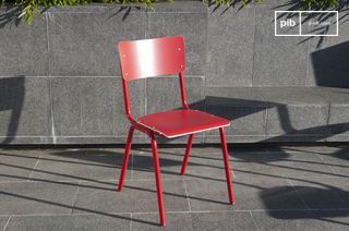
To integrate red furniture without unbalancing a space, it's necessary to clarify the visual hierarchy. Red should correspond to a defined function: entry point, secondary seating, signage surface. It goes well with raw materials (concrete, light wood), cool neutrals (gray, black) or earth tones (brown, ochre). The accumulation of red in the same visual field is not recommended, except in specific cases, such as symmetry or modular repetition. In a functional logic, red furniture is used to articulate, not to decorate.
The *Red* category presents furniture where color is used as a tool for structuring space. Each piece combines material, surface and volume to create a readable balance, without overload or superfluous decoration.
